Notes from
the studio.
Design, hospitality, business, Portland, projects in progress, and the things we keep noticing.
Start reading ↘Useful thinking, honest project stories, and a view into the life around the work.
The questions clients ask us most, answered honestly — plus the project stories, studio news, and Portland observations that don't have another home on this site.
Six subjects we keep coming back to: Hospitality, Commercial, Residential, Studio News, Gallery, and Portland.
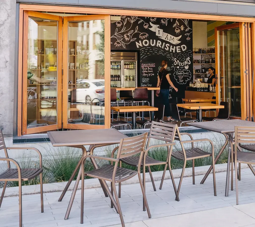
Before you sign a restaurant lease
Twelve questions smart operators ask to expose constraints, protect leverage, and avoid preventable delays in a Portland build-out.
Read the story →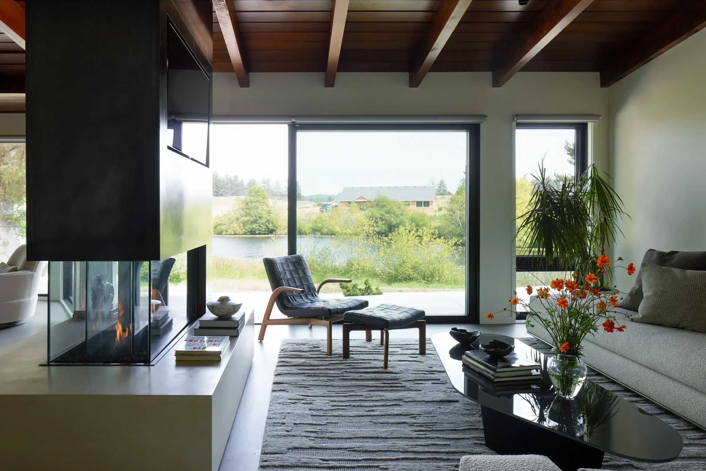
From "just new furniture" to a complete transformation
How an honest early conversation changed the scope, orientation, flow, light, and life of a midcentury lake house.
Read the story →When clients go smaller, the work gets more complex
A practical framework for planning boutique commercial interiors around flow, feel, and friction.
HospitalityHospitality everywhere
Why welcoming design is not limited to hotels and restaurants, and why feeling matters long after the first impression.
WorkplaceWhy commercial office lobbies matter more than ever
How arrival spaces influence tenant perception, identity, connection, and leasing performance.
Studio lifeBringing a shared dream to life: our gallery space
The story behind turning part of the WDP building into a public-facing creative room for Portland.
PortlandFinding your place in Portland
A personal look at helping people create homes that feel grounded in the city and the life they came here to build.
Hospitality
Feeling, welcome, gathering, ritual, and what makes people want to stay.
Commercial
Leases, test fits, lobbies, restaurant planning, workplace, brands, and the realities behind opening.
Residential
Remodels, daily life, decision making, furniture, materials, and the stories behind complete homes.
Studio News
Projects, people, events, collaborations, and what is happening inside WDP.
Gallery
Artists, exhibitions, interviews, and the ideas that enter the studio through the work on the walls.
Portland
The city, its creative community, its buildings, and why place matters to the way we design.
Read what is useful.
Stay for what is personal.
A few thoughtful emails each year. Choose studio news, Gallery WDP updates, or both.
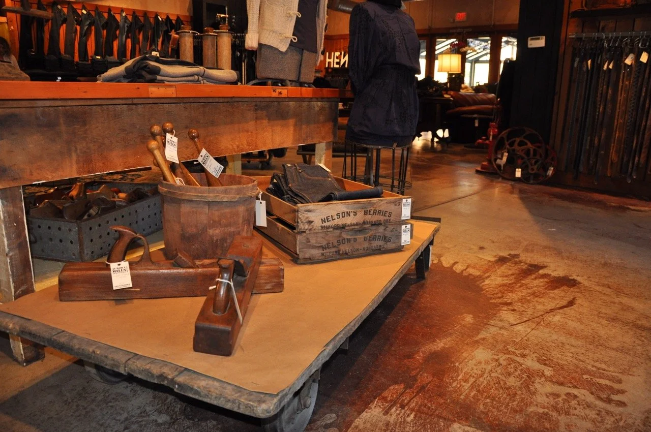
Your Storefront Has a New Job
You can buy almost anything without leaving the house. So when someone walks into a store anyway, the room has to give them something a website can't: an experience worth remembering, a reason to gather, and a feeling they'll tie to your brand.
You can buy almost anything without putting on shoes. A candle, a sweater, a lamp, a case of wine. It'll be on the porch by Thursday.
So when someone walks into a store anyway, they come for something more. That's where we start when designing retail projects: what will this room give people that a website can't?
Nobody has to be there anymore
Downtown Portland Clean & Safe's latest foot traffic report puts weekend visits within about 10% of 2019. Office worker traffic is still down by nearly half.
Read those two numbers together and the shift is clear. Fewer people pass a storefront because it happens to be on their way to work. More people are out because they decided to be. They're meeting someone, seeing a show, spending a Saturday.
That changes the job of the store. A space that once relied on convenience now has to earn the visit.
Sell the experience, not just the object
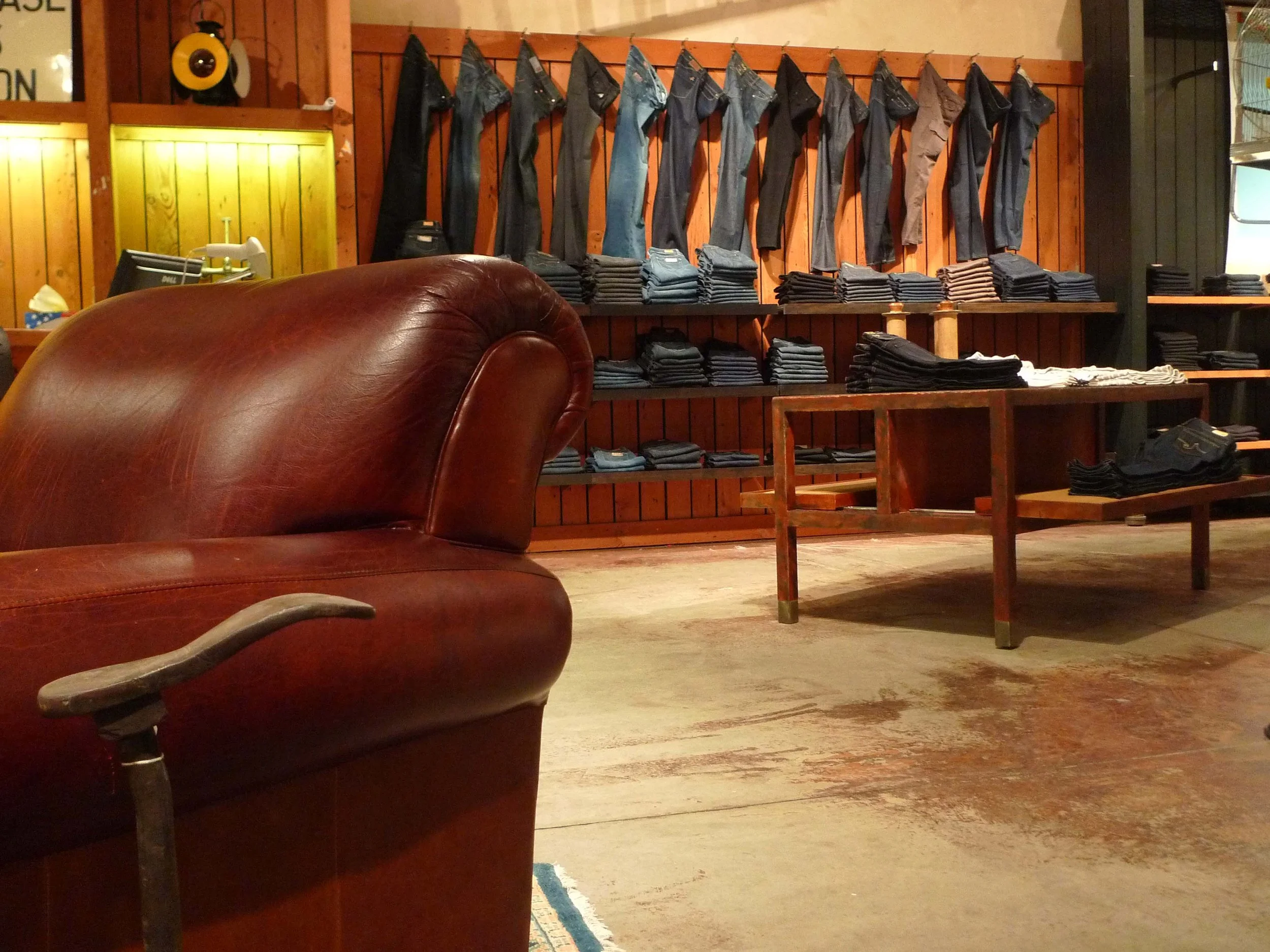
Cothing retail store with lounge seating designed by Weedman Design Partners
Good lighting and clean merchandising still matter, but they aren't why people come. The most memorable retail spaces erase the line between buying something and experiencing it. A store can let you feel what life with the product is like: the kitchen where the knives are actually in use, the living room you can sink into, the clothing shown the way someone would really wear it. Or it can offer a new way to see something familiar, through how it's displayed, lit, paired or explained.
That's the difference between a store and a retail experience. One completes a transaction. The other gives people a moment they remember.
And that memory attaches to your brand. When someone has a genuinely good time in your space, the feeling travels with the name on the door. They tell a friend. They bring someone next time. They share a photo because the room was worth photographing. A customer who had a great experience becomes an amplifier for your business, and that kind of word of mouth is hard to buy.
This is why we think of the interior as part of the brand, not a container for it.
Give people something to show up for
The most reliable way to draw people in is a reason with a date on it. A trunk show. A tasting. A book signing, a maker demo, a talk, an opening. An event turns a store someone might visit someday into a date on someone's calendar.
Collaborations do the same thing and widen the circle. A clothing shop hosts a florist for a weekend. A furniture showroom lends its floor to a chef for one night. A home goods store gives a wall to a local artist and changes it every season. Each partner brings its own audience through the door, and both brands feel more alive for it.
We see this in our own studio on NW 23rd, which doubles as a gallery. The openings bring people through our door who might never have walked into a design studio otherwise.
Design the room to change
Events don't work in a space that was only drawn for a quiet Tuesday afternoon. If gatherings are part of the plan, the design has to account for them from the start.
That means fixtures that roll, fold or nest, and a place to store them. Lighting on scenes, so the room can shift from daytime retail to evening. Power where a bar, a DJ or a demo table will actually go. A counter that can work as a bar. Enough open floor to hold a crowd without clearing the whole store. Acoustics that let people hear each other. And an early look at code, since regularly hosting a crowd can change occupancy and egress requirements.
None of this is exotic. It's just far less expensive to build in than to add later.
Spend where the visit happens
This is where we encourage clients to invest a little more, even if it means less room for display. A store packed to the walls has no room for anything else to happen, and it starts to feel like the website, only slower.
The better investments are the ones that are hard to add later: a storefront that invites people in, finishes that hold up to a crowd, and one piece of real craft that tells visitors someone cared. It can feel like money spent on something other than selling. It's closer to marketing with a longer shelf life. A campaign runs for a few weeks. A great room works every day the doors are open.
Start before the lease
There's a practical side to this, too. Portland's retail availability was 4.9% last quarter, according to CBRE. Good space isn't easy to find, which means many tenants will end up in second-generation spaces built for someone else.
That's fine. Often it's better than fine. But it's the moment to ask hard questions, before you sign. What can a customer see from the sidewalk? Does the plan naturally draw someone toward the back? Is there enough storage? What will the existing mechanical system allow, and what will accessibility require? How much of what's already there is actually useful?
A space that looks wrong on the first walkthrough can turn out to be exceptional once it's properly test fit. A space that looks perfect can hide an expensive surprise. A few hours of design thinking up front is the least expensive time in the whole project.
A reason to stay
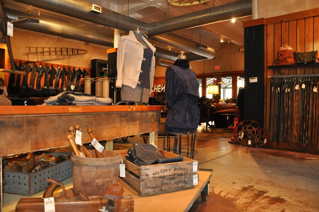
Retail design by Weedman Design Partners: incorporating vintage product into a clothing retail store creates a more dynamic atmosphere.
Portland has always done its best retail in places with personality: the shop where the owner knows your name, the bakery that doubles as a neighborhood living room. That instinct matters more now, not less.
People are choosing where to spend their time. A good storefront gives them a reason to come in. A great one gives them a reason to stay a few minutes longer. Those minutes are where design earns its keep.
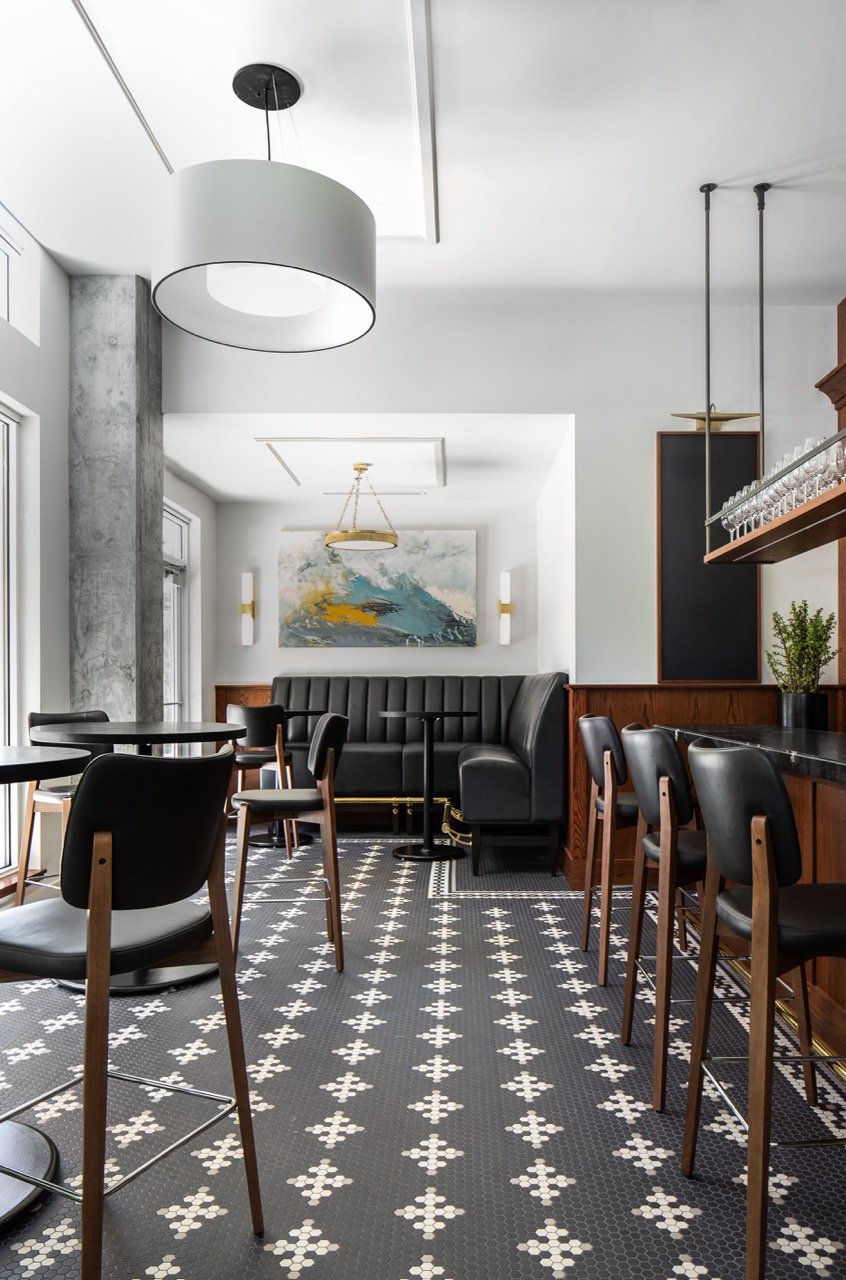
Seat Count vs. Revenue: The Layout Decisions That Shape Restaurant Performance
A strong seating plan is not a grid. It is a portfolio. This post breaks down how seat variety, hierarchy, and flow can improve dining room performance over time, helping restaurants balance energy, comfort, and operational ease without defaulting to a cafeteria plan.
Most owners start by asking for more seats.
The better question is how many good seats the room can actually support.
Seat count is easy to measure, which is why it often becomes the headline number. But the number on a seating plan does not tell you how the room will actually perform. A restaurant floor plan shapes how guests move, how staff works, how long tables stay occupied, and whether the experience earns repeat visits.
A room can fit more seats on paper and still underperform in service. It can feel loud, exposed, compressed, or harder to enjoy than the seat count would suggest. It can also be more difficult to operate, which is where “extra seats” quietly start costing money through slower service, weaker turns, staff fatigue, and a less consistent guest experience.
That does not mean a full room is a bad room. Some of the best restaurants feel energetic, busy, and fully occupied by design. We have seen that work well. The goal is not to make a room sparse. The goal is to make density feel intentional, comfortable, and operationally supportable.
The goal is not maximum seats
It is the maximum number of seats the space can support without hurting service, comfort, or the overall experience.
Too much density can create stress. Too little density can make a room feel flat, exposed, or under-energized. The sweet spot is a room that feels alive without feeling crowded.
A “good seat” is one that:
feels comfortable, not exposed
sits outside the main traffic flow
can be served efficiently
supports the pace and type of dining your concept is built for
A room full of average seats is rarely as profitable as a room with fewer seats that guests actually want, and staff can serve well.
A common layout mistake that hurts performance
The cafeteria plan
A “cafeteria plan” shows up when maximizing table count becomes the main objective, and circulation, comfort, and service support get pushed to the margins.
It tends to create:
long, exposed rows of similar tables
a one-note dining experience
busy aisles and constant near-misses
a room that may look full but does not feel memorable
This shows up in restaurants at every price point. And once it is built, it is hard to fix without removing seats. The better approach is not simply fewer seats. It is the right seat count, the right spacing, and the right mix of seating types for the concept. Some restaurants should feel lively and tightly packed. Others need more breathing room. The point is to create the kind of energy the concept promises, without making the room harder to operate.
One of the biggest upgrades you can make is seat variety
The best seating plans work like a portfolio of seating options, not a grid
If you want a restaurant to feel dynamic, you do not necessarily need more square footage. You need a more intentional mix of seating experiences.
A strong seating plan is not just a collection of tables. It is a portfolio of seating styles and options, each serving a different purpose in the room. Some seats support speed. Some support comfort. Some create privacy. Some help with flexibility. The value is in the mix.
When that mix is designed well, the room performs better. More guests can find a seat that feels right for the occasion. Staff can serve the floor more efficiently. The dining room gains rhythm, variety, and resilience instead of relying on one repetitive seating type to do everything.
That portfolio might include:
Fast seats
In many concepts, bar and counter seating help absorb in-between demand and give shorter visits a natural home. They can also reduce pressure on table inventory during peak periods.Anchor seats
Booths and banquettes are often among the most-requested seats because they increase comfort and perceived value. They also help create consistency in the guest experience, as long as they are balanced with enough flexibility elsewhere in the room.Flexible seats
Two-tops that combine cleanly help handle party mix without rebuilding the room every service. Flexibility works best when it is designed in from the beginning, not improvised on the floor.Destination seats
A slightly separated corner, a banquette with a view, or a subtly elevated area can create the “special table” effect. These seats are often remembered, requested, and worth waiting for.Communal seats
Communal seating can work beautifully when it aligns with the concept and service model. Otherwise, it can become one of the hardest seat types to sell consistently.
This is how you avoid the cafeteria plan. Not by layering on more design gestures, but by creating hierarchy in the room and building a portfolio of seating options that support different dining speeds, different party types, and different reasons people come in.
Six seating and flow principles that pay back over time
1) Start with movement, not furniture
Before you place tables, map the real movement paths:
entry to host
host to waiting
waiting to table
table to restrooms
server routes and food runs
bussing and back-of-house loops
If circulation is messy, the dining room will feel messy.
2) Give waiting a real home
Waiting happens, even in well-run restaurants. If you do not plan for it, it shows up in the worst places: the entry, the bar aisle, or the path to the restrooms.
A small, intentional waiting zone can make the entire restaurant feel calmer and more in control.
3) Decide which seats are actually your best seats
Every restaurant has best seats. The real question is whether they were designed intentionally.
Good layout work often starts by eliminating weak seats:
seats near restroom doors
seats in cross traffic
seats that feel overly exposed
seats that work on paper but not socially
A room can be technically full and still feel empty if the weakest seats remain unchosen.
4) Put service support where it belongs
Service stations are not leftover space. They are operating infrastructure.
If water, POS, bussing, staging, and storage are too far from the floor, staff steps increase, service slows down, and the room can feel understaffed even when labor is technically in place.
Plan these zones early so you do not end up sacrificing a strong table later just to patch the operation.
5) Know the difference between seat count and usable capacity
A dining room can physically hold a certain number of seats, but that does not mean it can comfortably serve them at peak.
Real capacity depends on more than chairs and tables. It depends on:
kitchen throughput
bar throughput
restroom demand
staff sections and distance to service stations
acoustics, temperature, and overall guest comfort
If the room feels too loud, too warm, or too cramped, guests change their behavior. They linger differently, order differently, return less often, and the financial impact shows up in ways a seating chart cannot predict on its own.
The opposite can also be true. If the room feels too spread out or visually under-occupied, it can lose atmosphere and social energy. Capacity planning is not just about how many people fit. It is about how the room feels when it is working the way you want it to work.
6) Treat code and accessibility as early design inputs
This is where projects often lose time and money when these issues are addressed late.
Egress, occupancy load, door swings, clearances, and restroom requirements all shape what is truly possible. You do not need to become a code expert, but the plan does need to be developed with those realities in mind early rather than retrofitted later.
A quick “one more table” test
If you are tempted to squeeze in one more two-top, ask:
Would a guest choose this seat if better options were available?
Does it make the room harder to serve or harder to move through?
Does it flatten the room into a cafeteria plan?
If the answer is yes, that table is not a revenue seat.
It is a stress seat.
Closing
A great restaurant layout makes the room feel natural. Guests move through it easily. Staff can run the floor without constant improvising. And the best seats feel intentional, not accidental.
The win is not the highest number on a seating chart. The win is a space that runs smoothly, feels layered, and earns repeat visits.
A full room can absolutely work. A quieter room can too. The real question is whether the layout supports the kind of energy, service, and guest experience the concept is meant to deliver.
A better starting point than seat count is this:
How many good seats can this space support on a busy night, consistently?
If this resonates, we are always happy to have a conversation. You can reach us at info@weedmandesignpartners.com.
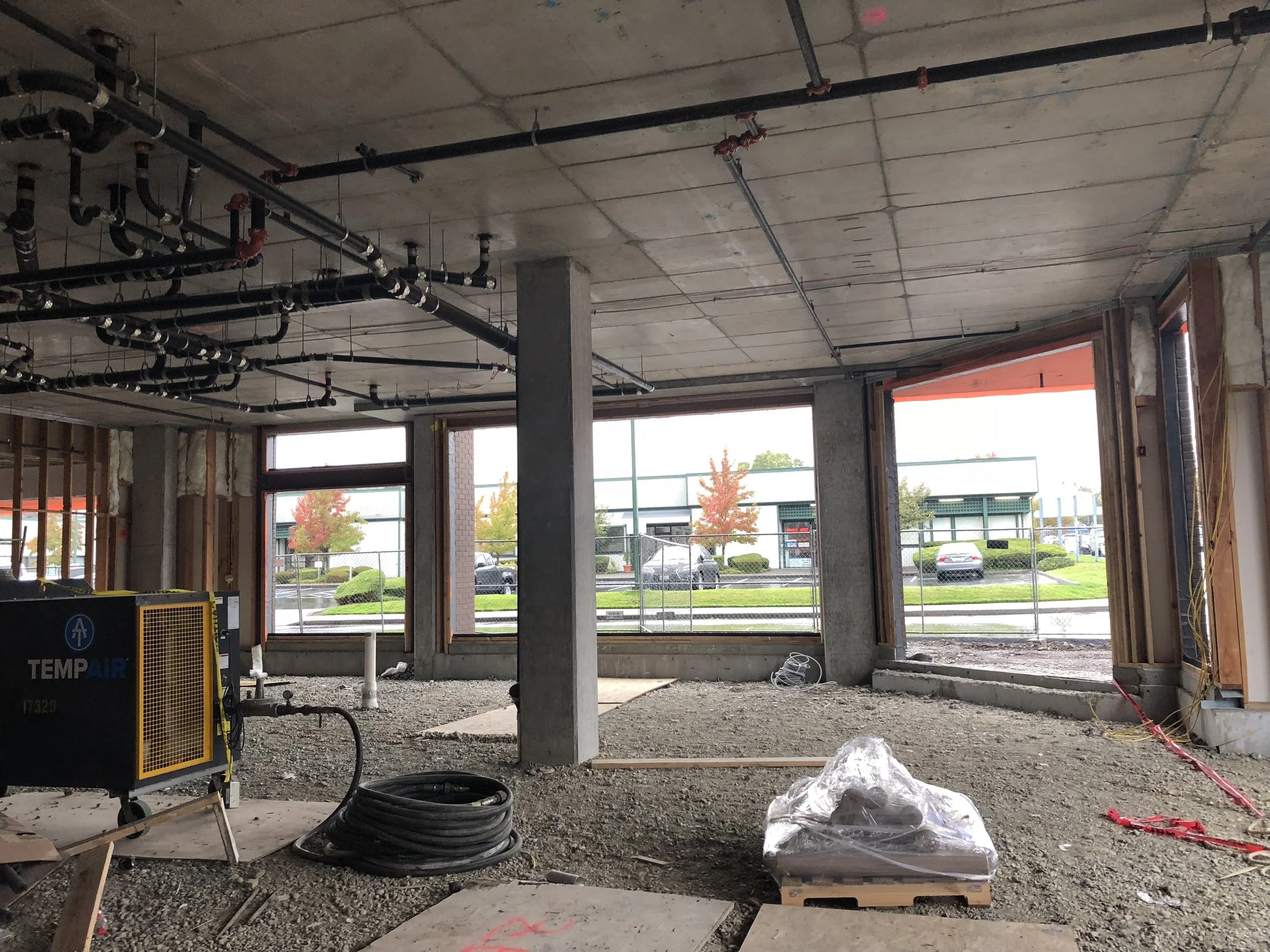
Before You Sign a Restaurant Lease: The 12 Questions Smart Operators Ask
“Restaurant-ready” is rarely a promise—it’s a starting point. These 12 questions are designed for experienced restaurateurs, café owners, and bar teams to surface hidden constraints, protect leverage, and avoid the preventable delays that cost months in a Portland build-out.
“Restaurant-ready” is rarely a promise—it’s a starting point. These 12 questions are designed for experienced restaurateurs, café owners, and bar teams to surface hidden constraints, protect leverage, and avoid the preventable delays that cost months in a Portland build-out.
The lease isn’t paperwork. It’s the first design decision.
Every operator has had the “dream space” moment.
Great corner. Great light. The right neighborhood. You can already see it: the first busy Saturday, the hum of the room, the bar seats that always fill first.
And then the lease (or the building) introduces its opinion.
Venting is harder than it looked. Utilities aren’t sized for the equipment list. The restroom scope is bigger than anyone expected. Landlord approvals add weeks you didn’t plan for.
None of this is rare. It’s also not bad luck.
The difference between a smooth build-out and a six-month delay is usually one assumption made too early—often wrapped in a comforting phrase like: “It used to be a restaurant.”
In the Portland metro, “restaurant-ready” can mean wildly different things depending on the building—especially in older spaces, mixed-use projects, and second-generation shells. The fastest way to protect your timeline is to surface venting, utility capacity, restroom scope, and approval timing early, before the lease locks in assumptions.
If you’re planning a build-out, this is the work we support every day in our restaurant interior design projects: turning “great space” into “feasible space” before you’ve committed your schedule and budget.
What follows isn’t a generic checklist. It’s the operator-level version—questions framed to reveal where the space will fight you, where the lease quietly removes optionality, and what will become the critical path.
The 12 questions (and why experienced operators still ask them)
1) “What exactly does ‘restaurant-ready’ mean here—and who is defining it?”
Ask:
Who is saying it’s restaurant-ready (broker, landlord, prior tenant)?
What scope is included—hood? grease? sprinklers? accessible route? restrooms?
What documentation exists (old permits, as-builts, prior TI drawings, hood cut sheets)?
Why it saves months: “Restaurant-ready” is marketing language until it becomes a defined scope. This one question turns a vibe into something you can plan.
2) “What was the last permitted use—not just the last use?”
Ask:
What was the last permitted occupancy classification?
Was the prior operation permitted as built, or operating under assumptions?
Any known deficiencies, open permits, or unresolved corrections?
Why it saves months: The city cares what’s documented. “It worked for them” doesn’t always translate to “it will be straightforward for you.”
3) “What does this building consistently make hard for food and beverage tenants?”
Ask the property manager and (if you can) neighboring tenants:
What do tenants complain about most?
Any recurring issues with grease maintenance, odors, deliveries, trash, noise, shared systems?
Why it saves months: Buildings have patterns. If there’s a recurring friction point, you want to know it before it becomes your problem.
4) “If we need a hood, what’s the real vent path—and who controls approvals for penetrations?”
Ask:
Is there an existing shaft/chase, and is it exclusive or shared?
Can ductwork go to roof or exterior—what are the constraints?
Who approves penetrations (landlord, HOA, city, historic review, etc.)?
What is the approval timeline in practice?
Why it saves months: Vent routing isn’t a detail. It’s often the layout’s dictator—and a major driver of cost and schedule.
5) “What is the grease situation—capacity, location, access—and who owns responsibility?”
Ask:
Trap vs interceptor? Where is it located and what capacity is it?
Is tie-in feasible without slab work?
Who is responsible for maintenance/pumping and compliance?
Why it saves months: Grease is where “simple build-out” turns into concrete cutting and coordination delays if it’s discovered late.
6) “What’s the utility reality—actual capacity, upgrade lead times, and who pays?”
Ask for specifics:
Electrical service and actual available panel capacity
Gas availability/pressure (if relevant)
Water line size/pressure and shutoffs
Then ask:
If upgrades are needed, what is the process and lead time?
Who pays, who manages, and whose schedule governs?
Why it saves months: Utility upgrades don’t slip by days. They slip by weeks. And they can become the entire schedule.
7) “Restrooms: what is compliant today, what is grandfathered, and what gets triggered by our concept?”
Ask:
Existing count and configuration
Current accessibility compliance status
Whether your seating/occupancy changes fixture requirements
Why it saves months: Restrooms are one of the most common scope surprises—especially when an operator assumes “we’ll just refresh.”
8) “HVAC: who controls it, who pays to modify it, and does it match our heat load?”
Ask:
Dedicated vs shared system, and control rights
Ability to modify ductwork or add equipment
If vented cooking is involved: what is the makeup air strategy?
Why it saves months: Comfort and odor control are operational essentials. HVAC changes are rarely quick, and they’re often approval-heavy.
9) “What is the landlord delivering—and what are they explicitly not delivering?”
Ask:
As-is vs warm shell vs vanilla shell (get it in writing)
Who handles demolition?
What base building work is excluded?
Any required contractor lists, bid requirements, or standards?
Why it saves months: This is where scope gaps hide. Scope gaps become schedule gaps.
10) “What’s the approval stack—and what approvals can’t start until after lease execution?”
Ask:
Signage and exterior modifications
Patio approvals (if applicable)
Rooftop equipment approvals
Penetrations, grease, venting, utility upgrades requiring sign-off
Any HOA/design review processes
Why it saves months: Approvals are often sequential. If one can’t start until the lease is signed, you need that in your critical path.
11) “TI allowance: is it support—or a control mechanism?”
Ask:
Is it cash, reimbursement, or a rent credit?
What documentation triggers payment, and when?
Does it cover soft costs (design/engineering)?
Contractor restrictions, bid requirements, scope approvals?
Deadlines or “use it or lose it” terms?
Why it saves months: Some TI structures genuinely help. Others slow the project down or remove your flexibility when you need it most.
12) “If we had to open in 120 days, what would stop us?”
Ask your team (operator + GC + designer) to answer honestly.
It’s usually one of these:
vent path approvals
utility upgrade lead times
restroom/ADA scope
long-lead equipment
landlord approval milestones
Why it saves months: This forces the critical path to surface early—while you still have leverage to negotiate, adjust scope, or pick a different space.Quick questions we hear often
What is a tenant improvement (TI)?
A tenant improvement (TI) is the design and construction work required to adapt a leased commercial space to your business—anything from a light refresh to a full build-out.
Does a smaller footprint reduce TI costs?
Sometimes it reduces certain costs, like finish quantities or overall build scope. But it can also increase complexity per square foot—especially if constraints (systems, code, approvals) are the real drivers.
What’s the biggest mistake when downsizing a commercial space?
Trying to “shrink the old plan” instead of redesigning the operational choreography. In smaller footprints, flow issues become expensive quickly.
What should be decided early on a TI?
Anything that will be costly to change later: the layout, major equipment placement, back-of-house needs, and the constraints that affect permitting, approvals, and systems coordination.
The operator takeaway: protect optionality early
The biggest lease mistake isn’t missing a question. It’s signing before you understand which parts of the project are:
Fixed: the building constraints and systems reality
Negotiable: TI terms, delivery condition, approvals, timelines
Designable: layout and guest experience
Optionality is what keeps a build-out moving when reality shows up. A lease signed too early doesn’t just affect money—it affects your ability to adapt without losing months.
A quick pre-lease feasibility pass can be the difference between “we opened on time” and “we’re still waiting on the one thing we didn’t know to ask about.”
If you’re evaluating a space and want to approach it with fewer assumptions and more control, our restaurant, café, and bar design work is built around exactly this: feasibility first, then experience.
Quick questions we hear often
How long does a restaurant build-out take in Portland?
It depends on scope, approvals, and building constraints. In many projects, the critical path is driven less by square footage and more by venting, utilities, restroom/accessibility scope, and landlord/city approval timelines.
What does “it used to be a restaurant” actually tell you?
It tells you the space has some relevant history—but not whether it matches your concept. Different equipment, occupancy, and service models can trigger very different requirements.
What’s the biggest mistake when signing a restaurant lease?
Assuming feasibility instead of confirming it—especially around venting, utility capacity, restrooms/ADA scope, and approvals that can’t start until after lease execution.
If this resonates, we are always happy to have a conversation. You can reach us at info@weedmandesignpartners.com.
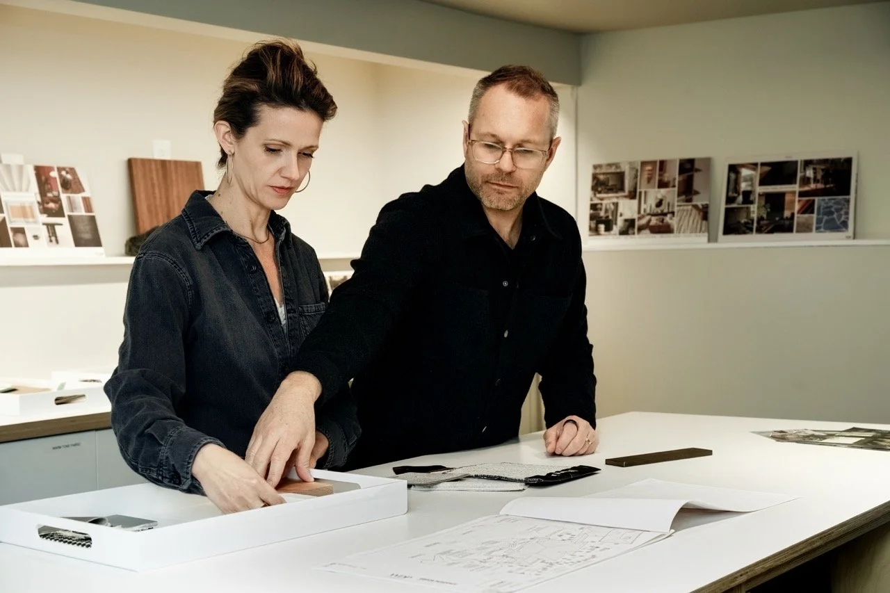
When Clients Go Smaller, the Work Gets More Complex
More commercial clients are choosing a smaller footprint—often to manage overhead, sometimes because a move is happening anyway. The surprise is that smaller doesn’t automatically make a project simpler. It often makes it less forgiving. In this article, Arielle shares a practical lens for planning boutique commercial interiors—Flow, Feel, and Friction—so the space works hard, communicates clearly, and avoids expensive surprises.
Designing boutique commercial spaces through Flow, Feel, and Friction
A lot of commercial clients are moving to a smaller footprint right now. Sometimes it’s strategic—tighten operations, sharpen the business, reduce overhead. But often it’s more straightforward: they’re trying to save money wherever they can, and if a move is already happening, taking less square footage can feel like the cleanest lever to pull.
That logic isn’t wrong. The part that surprises people is what comes next.
A smaller footprint doesn’t automatically create a simpler project. It creates a more complex one. There’s less slack in the plan, fewer places for problems to hide, and less room for “we’ll figure it out later.” The rent line item may go down, but the complexity doesn’t necessarily follow.
In the Portland metro, we’re seeing this play out most clearly in tenant improvements (TIs): clients right-sizing their space and expecting the build-out to be “smaller,” when the real challenge is that the decisions are simply more concentrated.
When a client chooses to go smaller, the goal shouldn’t be “shrink the old space.” The goal is to design a space that can carry the same business intent—often the same revenue goals, staffing realities, and customer expectations—with fewer square feet to work with.
The clearest way I know to approach that is through three lenses:
Flow. Feel. Friction.
They aren’t abstract design words. They’re a decision tool. Every meaningful choice either improves how the space works, strengthens what it communicates, or reduces the constraints that will otherwise control your budget and timeline.
Flow
Flow is how the space works—operationally and financially.
In a smaller footprint, circulation is not a design detail. It’s a business variable. The way people move, pause, queue, and transition becomes more visible—and more consequential.
What changes when clients go smaller is not just the scale of the plan. It’s the tolerance for inefficiency. A few extra steps for staff, a muddled pickup zone, or a line that intersects the entry can be the difference between a space that feels calm and intentional—and one that feels perpetually “a little stressed.”
The common challenge is that clients often downsize the lease but try to keep the same program: the same back-of-house needs, the same seating targets, the same merchandising expectations, the same service model. That’s when flow problems show up quickly, because the space is being asked to do too much without a clear choreography.
A useful question early on is this:
What is the space asking people to do—without instructions?
If the answer is unclear, flow needs to be solved before finishes, before lighting “moments,” before the fun parts. Because the fun parts can’t rescue a plan that doesn’t work.
This is where the pain shows up fastest in restaurant build-outs, cafés, boutique retail, and small office or studio spaces—anywhere the experience and the operations have to share every inch.
Feel
Feel is the emotional contract your space makes with people.
When clients go smaller to save money, there’s a predictable temptation: treat identity as optional. Cut the “extras.” Flatten the personality. Aim for safe. In practice, that’s often the most expensive kind of savings—because it can erode the very thing that allows a business to charge what it needs to charge.
High-end, boutique commercial environments aren’t defined by extravagance. They’re defined by clarity. Premium is rarely “more.” Premium is edited. It’s a smaller number of decisions, executed with confidence.
In a denser footprint, feel becomes even more important because the space has fewer opportunities to recover from visual noise or mixed signals. When everything is closer together, incoherence reads faster.
The right question here is:
If someone saw one photo of this space, what would they assume about the business?
That assumption is the feel of the space. And the goal is not to make it loud—it’s to make it unmistakably intentional.
In premium retail and wellness environments especially, “feel” is often the difference between a space that supports pricing power—and a space that quietly competes on discounts.
Friction
Friction is what the building fights you on.
This is the part that doesn’t shrink just because the footprint does.
Smaller spaces still have the same realities: existing conditions, systems limitations, code and accessibility requirements, landlord standards, approvals, and lead times. In many cases, going smaller reduces the number of places you can “route around” those constraints.
Friction becomes expensive when it stays unnamed until construction. That’s when the project starts making decisions for you—through change orders, substitutions, schedule shifts, and last-minute compromises that nobody is happy about.
The question I like to ask early is:
What are the three things about this space that could make cost or timeline unpredictable?
Name them. You don’t need perfect answers on day one. You need visibility. Because friction doesn’t care how strong the concept is—it will surface anyway. The only choice is whether it surfaces early enough to design around it gracefully.
On tenant improvements (TIs), this is also where permitting and landlord approval timelines can quietly become the critical path—regardless of how small the footprint is.
How these three lenses actually work together
Most smaller-footprint projects don’t struggle because anyone is careless. They struggle because the decision sequence is backwards.
Flow gets solved late, after commitments are made.
Feel gets treated like finishes instead of strategy.
Friction gets discovered in the field, when flexibility is lowest and costs are highest.
When Flow, Feel, and Friction are addressed in the right order, downsizing can be a smart move. The space becomes tighter, clearer, more intentional—and often more profitable per square foot.
When they aren’t, downsizing can simply relocate costs from the lease into the build: extra redesign, avoidable change orders, diluted identity, and lost time.
A closing thought
Going smaller can be a disciplined decision. But it asks more of the design, not less.
The goal isn’t to make a smaller version of an old space. The goal is to create a space that works harder—with fewer square feet to absorb uncertainty.
If you’re considering a smaller footprint, keep it simple:
Run the plan through Flow, Feel, and Friction before you commit to the parts that are expensive to change later.
That’s not pessimism. It’s good leadership.
Quick questions we hear often
What is a tenant improvement (TI)?
A tenant improvement (TI) is the design and construction work required to adapt a leased commercial space to your business—anything from a light refresh to a full build-out.
Does a smaller footprint reduce TI costs?
Sometimes it reduces certain costs, like finish quantities or overall build scope. But it can also increase complexity per square foot—especially if constraints (systems, code, approvals) are the real drivers.
What’s the biggest mistake when downsizing a commercial space?
Trying to “shrink the old plan” instead of redesigning the operational choreography. In smaller footprints, flow issues become expensive quickly.
What should be decided early on a TI?
Anything that will be costly to change later: the layout, major equipment placement, back-of-house needs, and the constraints that affect permitting, approvals, and systems coordination.
If this resonates, we are always happy to have a conversation. You can reach us at info@weedmandesignpartners.com.
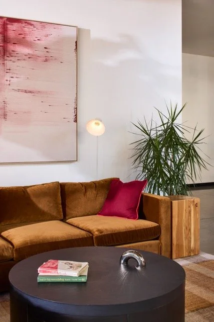
Why Commercial Office Lobbies Matter More Than Ever
Commercial office lobby design directly impacts tenant perception and leasing performance. This article breaks down the elements that help shared spaces feel intentional, current, and inviting.
First impressions have always mattered in commercial real estate. Today, they matter even more.
The office lobby is often the first physical interaction someone has with a building. Tenants pass through it every day. Prospective tenants form opinions there before a tour even begins. And yet, lobbies are frequently overlooked until a larger renovation or leasing challenge forces attention.
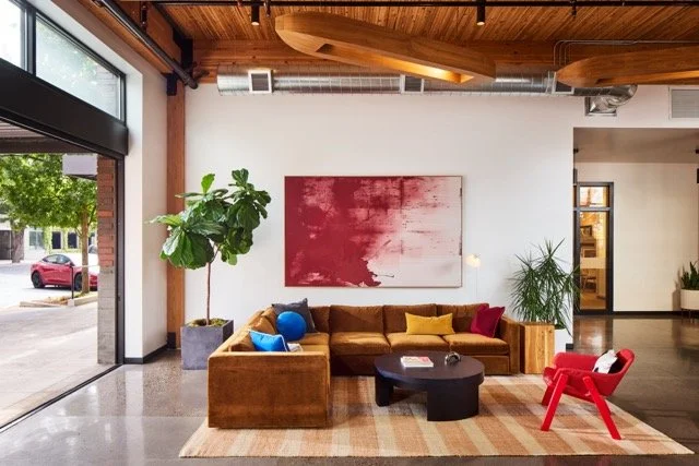
We recently completed a lobby update for a commercial office building that highlighted just how much influence these spaces have.
The lobby had been thoughtfully designed years ago and felt modern at the time. Then the pandemic shifted how buildings were used and occupied. Over time, the space became dated and inactive. Nothing was technically wrong, but it no longer reflected the energy or potential of the building.
Rather than pursuing a full renovation, we focused on a targeted update. The goal was simple: make the space feel welcoming, current, and intentional again.
The response was immediate. Tenants noticed the change right away. The leasing agent shared that prospective tenants were more engaged and interested in the building overall. A relatively modest investment changed how the space was experienced and talked about.
The Lobby as Part of a Building’s Street Appeal
We think of the lobby as an extension of a building’s street presence. It sets expectations before anyone steps into an elevator or suite. When a lobby feels neglected, it subtly suggests the building is reactive rather than proactive. When it feels cared for, it communicates confidence and vision.
Importantly, an effective lobby does not require excess. In many cases, restraint creates the strongest impact.
Elements That Make a Successful Lobby Update
While every building is different, a few principles consistently shape successful commercial lobby updates.
Biophilia and real plants
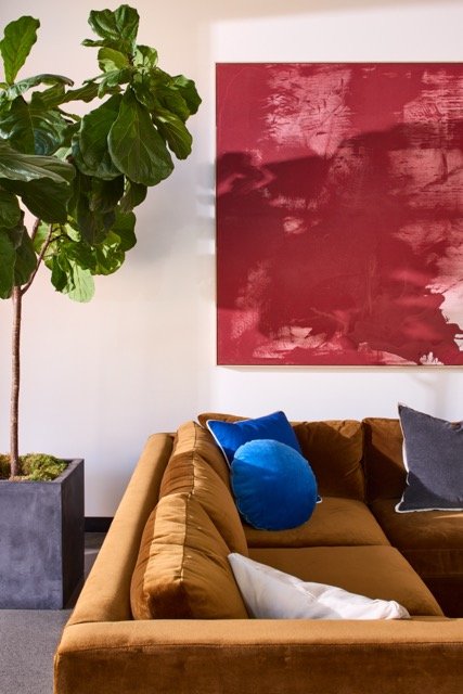
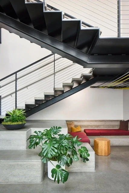
Living plants instantly bring life into a space. They soften architecture, improve air quality, and signal activity and care. Even minimal greenery can dramatically change how a lobby feels.
Intentional art
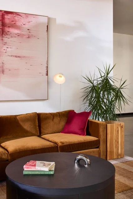
Art works best when it feels purposeful. Pieces by local artists or artwork created specifically for a space add meaning and help connect the building to its surroundings. Thoughtful art elevates a lobby without overwhelming it.
A mix of old and new
Depending on the character of the building, blending new furnishings with vintage or reclaimed pieces adds depth and authenticity. This layered approach helps spaces feel curated rather than generic.
Less, but better
One of the most common mistakes in lobby design is overfurnishing. Lobbies function best when they are open, legible, and easy to move through. A few well-chosen elements can completely shift perception.
Why Timing Matters
Owners and property managers often wait to invest in shared spaces until leasing improves. In practice, the opposite approach can be more effective. Updating a lobby early shows commitment and momentum, helping shape how the building is perceived in the market.
Design, when used strategically, becomes a quiet but powerful leasing tool.
This project reinforced something we see often: thoughtful, focused updates can breathe new life into a building. The goal is not to do more, but to do what matters.
If this resonates, we are always happy to have a conversation. You can reach us at info@weedmandesignpartners.com.

The Future of Office Lobbies: Designing Welcoming, Identity-Rich Entry Spaces
Discover how to transform your office lobby into a welcoming, functional space — even without a receptionist. Design tips, real-world insights, and best practices from a commercial interior designer.
Why Modern Office Lobbies Are Changing
"Hello? Anyone here?"
That’s the feeling so many people want to avoid when walking into a commercial lobby — and it’s one of the most common questions we're asked:
What do we do with the lobby if we don’t have a receptionist anymore?
Most offices today don’t have someone stationed at the front. But packages still arrive. Visitors still show up. And too often, there’s a big, empty space right at the entry that feels more like a question mark than a welcome.
We love this kind of design challenge. The solution always depends on the type of business, its culture, and how the space is used — but here are a few tried-and-true strategies we use when designing modern office lobbies that feel intentional, branded, and alive.
Designing an Entry Without a Receptionist
Even without a staffed front desk, your office lobby can feel warm, clear, and inviting. Here’s how:
Design for arrival. A rug, lighting feature, or shift in flooring can create a sense of threshold and signal that you've entered a thoughtfully designed space.
Include seating that invites use. Low, residential-style furniture grouped in clusters encourages employees or guests to use the space, making it feel active and alive.
Offer gentle wayfinding. If no one is there to greet guests, make it obvious what to do next. A small welcome sign, directory, or visual cue provides clarity without formality.
Create a front, not a back. If a space feels too casual or unstructured, guests might think they’ve come in the wrong door. A small concierge desk or focal design moment can reinforce that this is indeed the front of house.
How to Make Your Lobby Feel Welcoming
In our commercial interior design work, we focus on humanizing these spaces through warmth, texture, and storytelling.
Add real artwork. Thoughtfully selected pieces add soul and signal that someone cared enough to make the space beautiful.
Use biophilic elements. Plants and greenery bring life and soften the environment.
Leverage lighting. Layered, warm lighting feels more like hospitality than corporate.
Encourage use. Make it an alternative workspace with accessible power and Wi-Fi. Employees working from the lobby bring natural energy and movement to the space.
Tips for Branding Your Office Entry Space
One of the biggest missed opportunities in lobby design is lack of identity.
So many businesses shy away from displaying their name, worried about over-branding. But the opposite is more damaging — a guest who isn’t even sure if they’re in the right place.
We always recommend:
Professionally displaying your business name or logo in a subtle but clear way
Custom signage that integrates with the architecture and reflects your brand voice
Art and materials that reflect your values and sensibilities
When you walk into a thoughtfully branded lobby, you don’t have to ask, "Where am I?" The space tells you.
The Takeaway
The best office lobby design doesn’t rely on a receptionist to make people feel welcome. It uses space, materials, signage, and warmth to say:
You’ve arrived.
We were expecting you.
And yes — this space reflects who we are.
The Most Expensive Office Design Can't Buy What Your Team Really Needs to Excel
Here's the truth that might surprise you: once you've created a workplace that's safe, comfortable, community-oriented, and professionally inspiring, self-actualization comes down to something more fundamental…
In this final post of our series exploring Maslow's hierarchy in workplace design, we've reached an important realization about the summit: self-actualization. While thoughtful design can lay the groundwork through safety, belonging, and professional pride, the pinnacle of workplace satisfaction isn't actually about design at all.
Here's the truth that might surprise you: once you've created a workplace that's safe, comfortable, community-oriented, and professionally inspiring, self-actualization comes down to something more fundamental—your company culture. No amount of thoughtful design can help employees reach their full potential without a culture that truly supports growth and development.
Think about it: design can create the conditions for excellence, but culture determines whether it flourishes. This is why some companies achieve breakthrough innovation in modest spaces, while others struggle despite having every amenity. It's not about the price tag—it's about the people.
Throughout this series, we've explored how workplace design can support human needs—from basic safety to professional pride. But perhaps the most important lesson is knowing when design should step back and let culture lead.
Thank you for following along! If you're thinking about how to transform your workplace into an environment where your team can truly thrive, I'd love to chat. Whether you have questions about where to start or want to explore specific ideas for your space, reach out anytime. Let's have a conversation about creating a workplace that both you and your team will love.
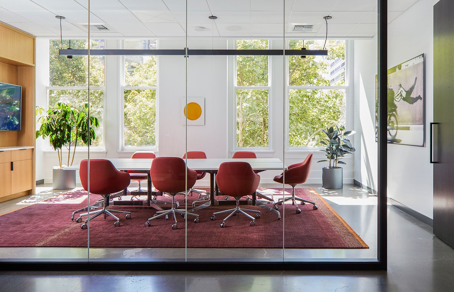
RTO: Let’s get out of the sweatpants mindset
When was the last time you felt truly proud of your workspace? Your employees are asking themselves the same question every day.
When we map Maslow's hierarchy to workplace design, we often overlook how deeply our surroundings influence our sense of self-worth. A polished, professional environment doesn't just look good—it fundamentally shapes how employees view themselves and their work.
When was the last time you felt truly proud of your workspace? Your employees are asking themselves the same question every day.
When we map Maslow's hierarchy to workplace design, we often overlook how deeply our surroundings influence our sense of self-worth. A polished, professional environment doesn't just look good—it fundamentally shapes how employees view themselves and their work.
The Impact of a Professional Workspace
Think about it: How do you carry yourself differently in a beautifully styled outfit? The same principle applies to the workplace. Employees elevate their performance when their environment signals professionalism and excellence.
Today’s workplace must deliver:
Well-designed personal spaces that employees can own and customize
Private offices where appropriate—not every company needs to be open plan
Professional-grade tools and technology that say, "We invest in your success"
Thoughtfully curated finishes that reflect company standards
Spaces employees are proud to share with clients
Meeting rooms equipped for polished presentations
Design details that demonstrate attention to quality
Why Design Matters in the Workplace
The impact is profound. In a premium environment, teams naturally conduct themselves more professionally, taking greater pride in their surroundings and their work. Client meetings carry more gravitas, and work products become noticeably more refined. When given better tools and technology, innovation flourishes. Most importantly, confidence grows organically in an environment that reflects professional excellence.
Aligning Environment with Excellence
Here’s the secret: It’s not about luxury—it’s about alignment. A workspace that mirrors the caliber of work you expect validates professional identity. Employees see their surroundings as a reflection of their value, and they rise to that standard.
A Case Study: Apex Clearing
Take Apex Clearing, for example, located in the historic Meier & Frank building in downtown Portland. One standout design feature in their space is the art collection. Rather than opting for generic, branded pieces, the collection showcases works by exceptionally talented artists. These carefully curated pieces inspire employees to think creatively, aspire for greater accomplishments, and approach challenges with fresh perspectives.
Unlocking Potential Through Design
When we design spaces that inspire pride, we unlock potential. Let’s talk about how your workplace can reflect and reinforce your team’s excellence—because when employees feel proud of their environment, they’re proud of their work.
Next Post:
I’ll explore the pinnacle of workplace design—creating spaces that inspire innovation and enable peak performance.

Conference room for Apex Clearing, in Portland, Oregon
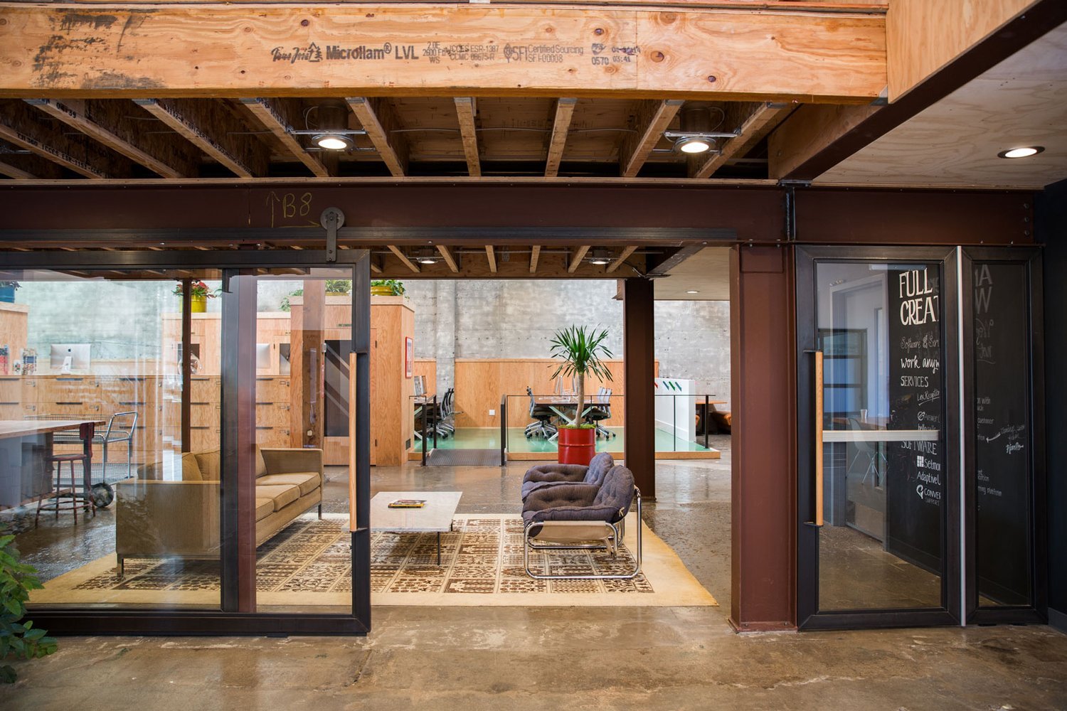
RTO: Fostering Real Connection in Workplace Design
Why do some offices buzz with energy while others feel like ghost towns? The answer isn't in your amenities—it’s in understanding the third level of Maslow's hierarchy.
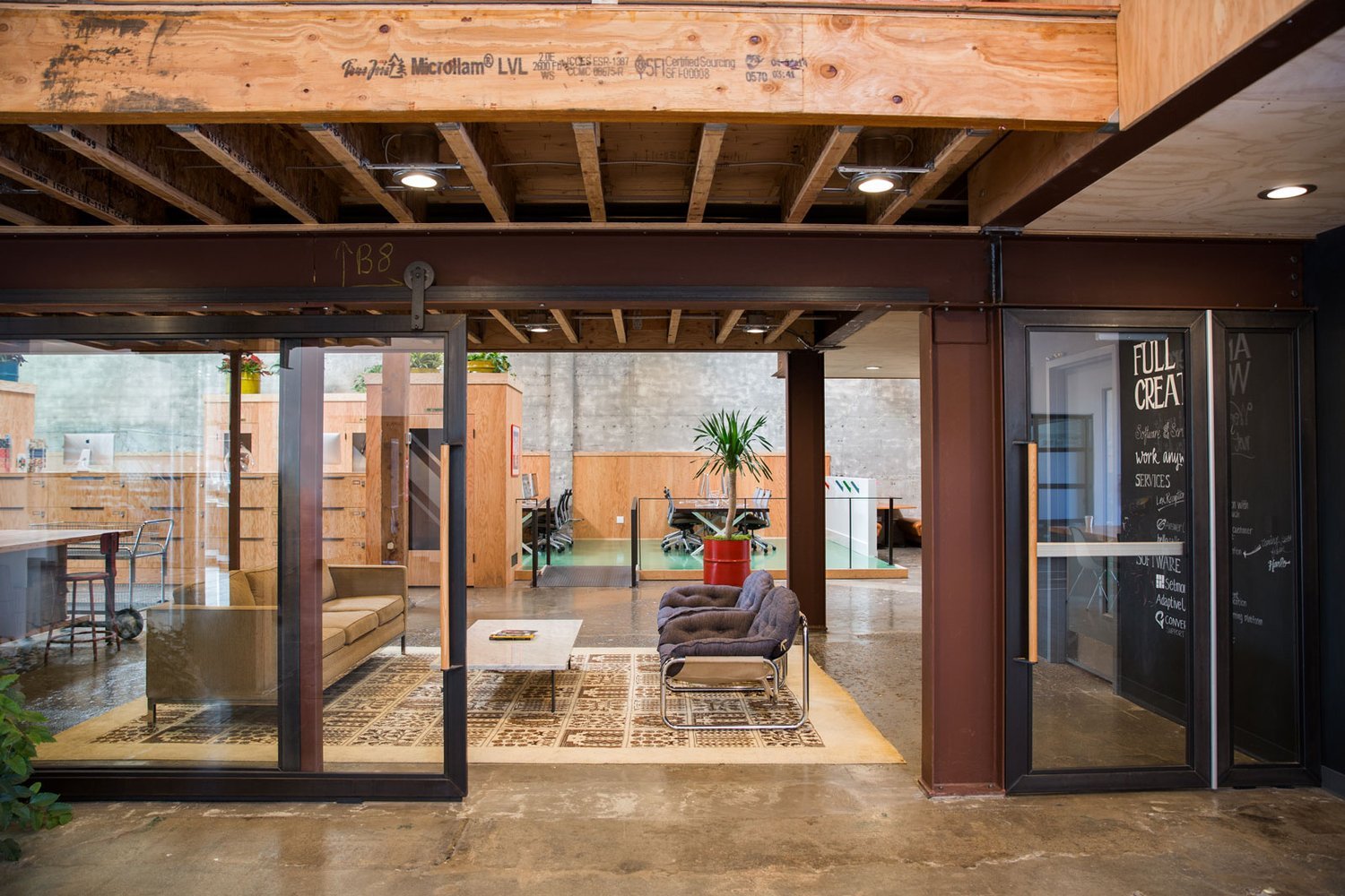
Office entry from the communal hall at 11Main
Why do some offices buzz with energy while others feel like ghost towns? The answer isn't in your amenities—it’s in understanding the third level of Maslow's hierarchy.
In my last post, I explored the foundational layers of Maslow's hierarchy in workplace design—physiological comfort and safety. Now, let’s talk about the next critical level: belonging. When basic needs are met, employees seek meaningful connection.
The Importance of Belonging in the Workplace
The key insight? Community can’t be manufactured through design alone. Understanding your organization’s unique culture is essential, often requiring collaboration with specialists who can uncover the deeper patterns of how your teams interact and connect.
Characteristics of Successful Community Spaces
Successful community spaces:
Reflect authentic company values, not trendy design
Support existing cultural rhythms and rituals
Provide choice in how to engage
Eliminate friction points that discourage interaction
Accommodate both planned and spontaneous gatherings
Tailored Workplace Design for Unique Cultures
The design that sparks community varies widely:
Some teams build connection through shared meals
Others thrive on impromptu brainstorming
Many need quiet spaces for focused work and mentorship
Some cultures value privacy, others transparency
Remote-first teams need different connection points than in-person ones
A Case Study: 11 Main
We’ve seen the power of culturally aligned design firsthand. At 11 Main, we helped our client transform their workplace from an outdated and quiet cubicle farm into a dynamic environment that reflects their commitment to sustainability and community engagement.
The space now features:
A welcoming ground floor that connects with the neighborhood
Design elements showcasing their environmental mission
Starting with Deep Listening
The transformation from a lifeless office to a vibrant community hub starts with deep listening.
What cultural shifts are you trying to achieve?
How do your most engaged teams already connect?
What barriers prevent the connections you want to see?
Learn More
To see how thoughtful design can transform workplace culture, visit our case study of 11 Main. Let’s discuss how we can create a similar alignment between your workplace design and cultural aspirations.
Next Post:
I’ll explore how workplace design supports professional growth and innovation—the peak of Maslow's hierarchy.

RTO Basics: The Simplest Design Solutions to Encourage Employees to Show Up
Before you invest in that fancy espresso bar or game room for your office, let's talk about why your employees might not even show up to use them.
Before you invest in that fancy espresso bar or game room for your office, let’s talk about why your employees might not even show up to use them.
While these may not seem like the most exciting or innovative aspects of office design, they form the critical foundation of workplace satisfaction. Just as Maslow’s hierarchy of needs demonstrates, we can’t reach higher levels of engagement and innovation without first establishing these fundamental elements.
The Foundation of Workplace Satisfaction
As leaders push for return-to-office (RTO), many are missing a crucial truth: You can’t expect employees to innovate, collaborate, or perform at their peak when their basic needs aren’t met. Looking at Maslow’s hierarchy, workplace satisfaction starts with the physiological and safety layers—both of which have evolved dramatically post-pandemic.
Physiological Needs in the Modern Workplace
The baseline isn’t just desks and WiFi anymore. Today’s workforce requires:
Ergonomic workstations that adapt to individual needs
Technology infrastructure enabling seamless collaboration, particularly with remote teams
Natural light, comfortable temperature, and proper acoustic conditions
Flexible spaces that support various work styles
Safety and Security: The Overlooked Essentials
But here’s where many organizations fall short—safety and security. Employees need to feel secure without feeling confined. Modern safety includes:
Professional front-desk staff (yes, it’s time to bring back a knowledgeable and friendly presence at the entry)
Thoughtful access control that welcomes guests and maintains security without creating awkward experiences
Comprehensive emergency procedures, including earthquake preparedness and family reunification plans
Enhanced air filtration and ventilation systems
Clean, well-stocked, and conveniently located restrooms
Employees who feel physically secure and physiologically comfortable can focus on work rather than survival.
The Cost of Ignoring the Basics
The real cost isn’t in providing these foundations—it’s in ignoring them. Every day your team worries about their security or struggles with inadequate workspace is a day of lost innovation and missed opportunities.
Thoughtful Design: The Key to Success
The key to successfully implementing these elements lies in thoughtful design. Each component—from the placement of workstations to the integration of security measures—requires careful consideration of both functionality and user experience. It’s about creating spaces that not only meet these fundamental needs but do so in a way that enhances rather than hinders the work experience.
I welcome the opportunity to continue this conversation! Contact us if you’d like to discuss how we can transform your workplace into an environment where employees want to be.
Next Post:
Stay tuned for my next post, where we’ll explore the next level of workplace design—creating spaces that foster a genuine sense of community and belonging in the office.
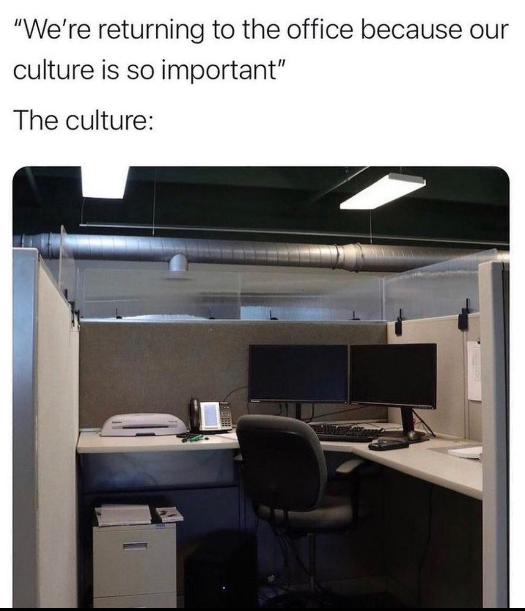
The Great Return - Rethinking Workplace Magnetism
The return-to-office debate continues to dominate C-suite discussions, but perhaps we’re asking the wrong question. Instead of "How do we get people back?", the better question is: "How do we create spaces people are drawn to?"

The return-to-office debate continues to dominate C-suite discussions, but perhaps we’re asking the wrong question. Instead of "How do we get people back?" the better question is: "How do we create spaces people are drawn to?"
Not every company can afford a state-of-the-art environment. For start-ups, securing a workspace, buying laptops, and occasionally providing lunch may suffice. But what surprises me is how many businesses that can afford to invest in their environments choose not to.
Workplace Design Through Maslow’s Lens
This got me thinking about Maslow’s hierarchy of needs and its connection to workplace design. Just as humans require basic physiological needs met before pursuing higher aspirations, offices must fulfill foundational needs before inspiring innovation and collaboration. Breakthrough thinking is unlikely in spaces that fail to offer even basic comfort and safety.
This perspective has reframed how I approach the return-to-office conversation. It’s not just about managing real estate—it’s about designing environments that meet human needs, from the most basic to the aspirational.
Maslow’s Hierarchy in Workplace Design
Over the next few posts, I’ll explore how Maslow’s framework can guide workplace design:
Basic Needs: Ergonomic workstations, proper lighting, and robust technology infrastructure
Safety: Advanced air quality, acoustic comfort, and psychological security
Belonging: Collaborative spaces that foster connection and community
Esteem: Design elements that communicate value, recognition, and pride
Self-Actualization: Environments that inspire creativity, growth, and innovation
Crafting Magnetic Workspaces
The challenge isn’t about forcing employees back—it’s about crafting spaces magnetic enough to meet these human needs. When offices succeed in doing that, mandates become irrelevant.
Let’s Reimagine Your Workspace
I’d love to hear your thoughts, additions, or ideas on this approach. If you’re thinking about how to reimagine your office space, let’s connect—I’d be happy to discuss how we can create a space that draws people in.
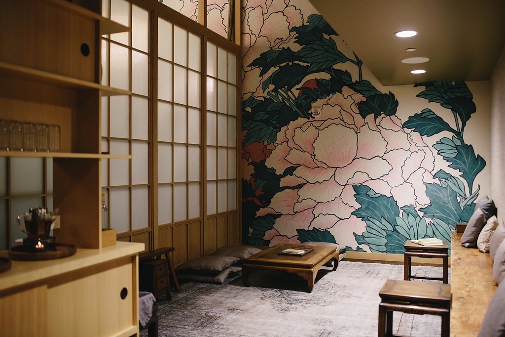
The Power of Branded Environments in Commercial Interior Design
At Weedman Design Partners, we view branded environments as more than just the look of a space. They are immersive experiences—designed to communicate your company’s identity. Whether it’s a retail store, office, or restaurant, the spaces we create serve as a reflection of your brand, shaping every interaction and leaving a lasting impression on clients, customers, and employees.

PiPH at Portland International Airport
When you think of branding, logos and colors often come to mind—but in commercial interior design, branding is about much more. It’s about creating spaces that reflect who you are, tell your story, and connect deeply with everyone who steps inside. It’s intentional. It’s meaningful. It’s not about slapping logos everywhere; it’s about feeling a sense of your brand in every corner.
What Are Branded Environments?
At Weedman Design Partners, we view branded environments as more than just the look of a space. They are immersive experiences—designed to communicate your company’s identity. Whether it’s a retail store, office, or restaurant, the spaces we create serve as a reflection of your brand, shaping every interaction and leaving a lasting impression on clients, customers, and employees.
It’s not about superficial touches, but thoughtful details. Every material, texture, light fixture, and layout choice is carefully considered to align with your brand’s values, vision, and goals.
Why Branded Spaces Matter
For Your Clients
A well-designed space makes an impact. Think about it: when your customers walk into your space, they should instantly feel the connection to your brand. In retail, that might look like an inviting, beautifully designed display that emphasizes your quality and exclusivity. In a restaurant, it could be a warm, rustic atmosphere that feels authentic and aligned with your values. Every detail is an opportunity to build trust, foster loyalty, and deepen that emotional connection with your brand.
For Your Team
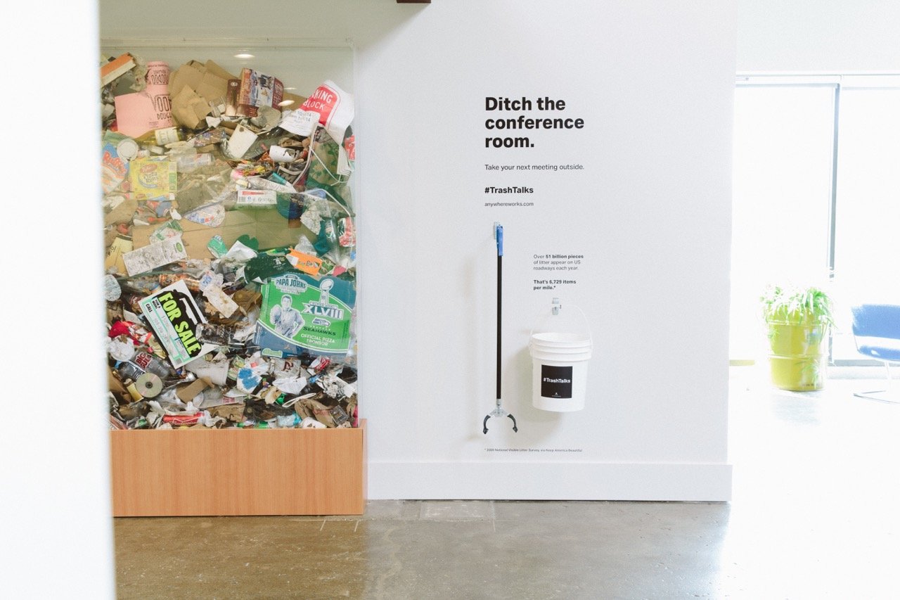
A custom trash display designed by WDP to highlight our client’s initiative to pick up trash during walking meetings
For the people who work with you, the environment can make all the difference. We all know that a space that reflects your values, culture, and mission helps people feel like they belong and are inspired. When a workplace encourages collaboration, sparks creativity, or just feels like a place where people are valued, it fosters a sense of pride and engagement. The space should be more than a place to work—it should be a space that helps your team thrive.
For Your Business
A strong, well-executed branded environment elevates your business. When clients and customers walk through your doors—whether it’s an office, a storefront, or a restaurant—the impression is immediate. A thoughtfully designed space signals professionalism, confidence, and care. It helps set the tone for all interactions and positions your business above the competition. It’s an investment in your brand’s credibility and long-term success.
Intentional Design: The Key to Success
At Weedman Design Partners, we design spaces with intention, not just for today but for the future. We dive into your story, your values, and your goals. We work alongside you to create spaces that are not only functional but also authentic—spaces that truly reflect your brand. Whether you’re designing a restaurant, an office, or a retail shop, we ensure that the environment supports your vision and grows with you.
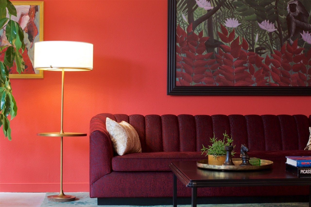
A Wes Anderson inspired lobby at The Margot, an apartment building on Southeast Divsion Street in Portland
Branded environments aren’t just a trend—they’re an investment in your brand’s future. Let’s create a space that’s more than just a place to be. Let’s create a space that represents who you are.
The Modern Office: Designing Spaces for Connection, Well-being, and Productivity
In a world where hybrid work has become the norm, many business leaders question the future of the traditional office. Do we still need a dedicated workspace, or can we rely entirely on remote setups? The answer lies not just in productivity, but in human connection, well-being, and inspiration.
In a world where hybrid work has become the norm, many business leaders question the future of the traditional office. Do we still need a dedicated workspace, or can we rely entirely on remote setups? The answer lies not just in productivity, but in human connection, well-being, and inspiration.

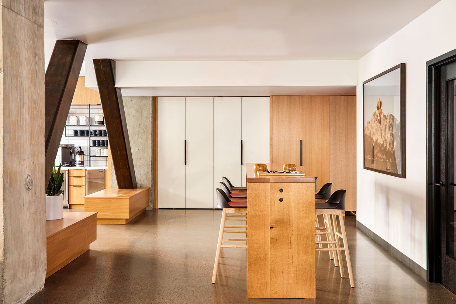
Entry to an open office designed by Weedman Design Partners that encourages employees to connect with neighboring businesses
Why We Still Need the Office
As social beings, humans thrive in environments where they can connect, collaborate, and build bonds. While remote work offers flexibility, it can also lead to isolation, a lack of connection, and a diminished sense of purpose. The office, when designed thoughtfully, can foster a strong sense of community and belonging, allowing employees to bond over shared goals and experiences. Studies show that a sense of belonging in the workplace can increase job performance by 56% and reduce turnover risk by 50%. It’s not just about showing up and producing work; it’s about building relationships that motivate, inspire, and encourage individuals to give their best.
Reimagining the Office: A Space for Connection and Purpose
The role of the office has shifted. It’s no longer just a place to clock in and complete tasks; it’s a place for human connection, collaboration, and inspiration. This shift requires leaders to reconsider the design of their workspace. Each company is unique, and so should be its office environment. This is an opportunity for business leaders to thoughtfully design spaces that nurture people’s interests, promote well-being, and offer a true sense of purpose.

Make it stand out
The office environment creates opportunities to connect with coworkers and reinforce your company's core values. In this office, Weedman Design Partners built a custom display for trash collected from the neighborhood. The installation successfully brought together employees to walk more, engage with the surrounding neighborhood, and improve the environment.
Creating a Flexible Work Environment
Flexibility is key in today’s workforce. Studies show that offering flexible work schedules leads to higher job satisfaction and increased productivity. By providing flexibility through hybrid models or fluid work hours, businesses allow employees to balance their professional and personal lives more effectively. The office, then, becomes a hub for connection—a place to go for inspiration, collaboration, and problem-solving, rather than just a place to complete daily tasks.
Investing in People: The Real Return
Designing a workspace that considers the human experience isn’t just about aesthetics. It’s about making an investment in your greatest asset—your people. When employees feel connected, valued, and cared for, they are happier, more productive, and more likely to stay with your company long-term. In fact, organizations with highly engaged employees outperform their competitors by 147%. For employees, an office that is thoughtfully designed to nurture their well-being sends a powerful message: "We care about you as a person, not just as a worker." This recognition fosters loyalty, engagement, and a willingness to go the extra mile for the company’s success.
Designing for Success: An Opportunity for Leaders
For business leaders, the office is more than just a space; it’s a tool for growth. By designing an environment that aligns with the needs of your team, you create a culture that attracts talent, nurtures creativity, and promotes well-being. Every company’s office should reflect its values and mission, offering a space where employees can connect, collaborate, and feel a sense of purpose.
As designers, we specialize in creating office environments that reflect your company’s culture while also promoting work-life balance and fostering connections. Our goal is to design offices where employees not only want to work but want to thrive. Let’s reimagine what the office can be—a place where people feel inspired, connected, and ready to make a meaningful impact.
After all, when you invest in your people, the return on investment is immeasurable.
The Power of Green: Integrating Plants in Interior Design
In interior design, one timeless element stands out: plants!

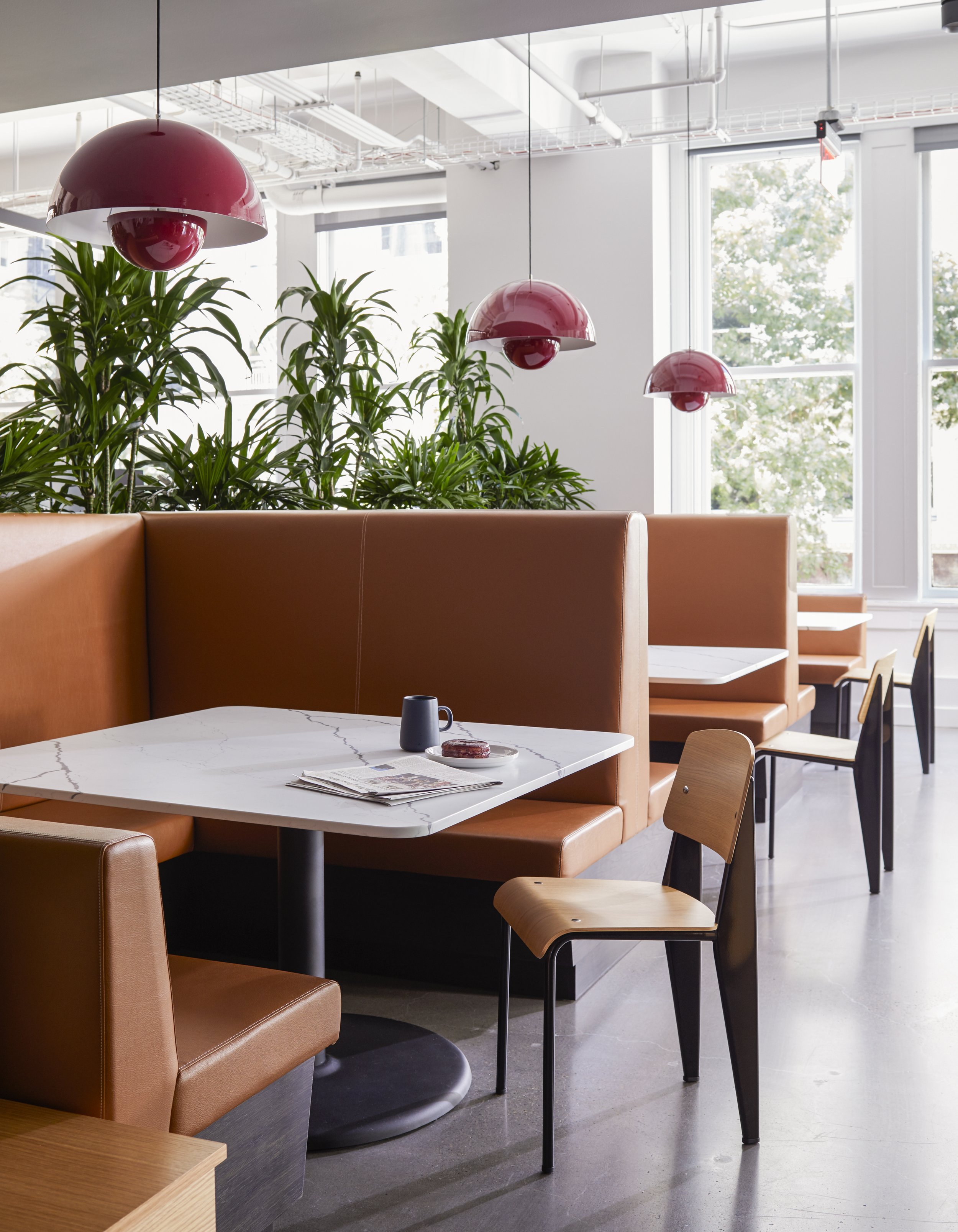
Plants behind a banquette seat at 3/Thirds
In interior design, one timeless element stands out: plants. At our interior design studio, we recognize the profound impact greenery has on both commercial and residential spaces. Plants enhance visual appeal, offer health benefits, and create a seamless connection between indoors and outdoors. This post explores the importance of incorporating plants into interior design, addressing common concerns about plant maintenance, and showcasing our expertise.

Plants activate and add interest to a corner at the Portland Apex Clearing office.
Visual Benefits of Plants in Interior Design
Plants bring unique vibrancy to any space. In residential interior design, they add texture, color, and tranquility. Imagine a cozy living room brightened by a lush fern or a kitchen enlivened by a row of herbs. These elements beautify a space and make it feel more inviting.
In commercial interior design, the visual impact of plants can be even more profound. Offices, hotels, and retail spaces benefit from the freshness and energy that plants provide. Strategically placed greenery can enhance the customer experience, create a welcoming atmosphere, and serve as a branding element. A well-designed green wall or potted plants can leave a lasting impression.
Health Benefits: Beyond Aesthetics
The benefits of plants extend far beyond their visual appeal. Studies highlight the positive effects of indoor plants on health and well-being. In residential spaces, plants improve air quality, leading to better respiratory health and a sense of well-being. Additionally, plants reduce stress, enhance mood, and increase productivity.
In commercial settings, the health benefits are significant. Healthier employees are more productive, take fewer sick days, and contribute to a positive work environment. Plants also help reduce noise levels, providing a more serene atmosphere in busy offices.
Bringing the Outside In
Incorporating plants into interior design bridges the gap between indoors and outdoors. This concept, known as biophilic design, emphasizes our innate connection to nature. By bringing natural elements inside, we create harmonious and balanced spaces.

Our firm frequently works with landscape designers to select plants and pots for outdoor spaces adjacent to the home.
In residential design, this might mean integrating large windows with garden views, using natural materials, and incorporating plants throughout the home. In commercial design, biophilic elements transform sterile environments into dynamic spaces. Indoor gardens, green walls, and thoughtfully placed plants make urban offices feel closer to nature, fostering calm and inspiration.
Overcoming the Fear of Plant Maintenance
Despite the benefits of plants, many hesitate to incorporate them due to maintenance concerns. As an experienced interior design studio, we offer solutions to ensure plants thrive in any environment.
Our team recommends low-maintenance options for busy lifestyles and has partnerships with plant care services for regular maintenance. Whether selecting the right plants or providing ongoing care, we are here to help every step of the way.
Our Passion for Plants
At our interior design studio, we love plants and their transformative power. We always look for opportunities to introduce greenery, whether a single statement plant or an elaborate green wall. Our passion for plants reflects our commitment to creating beautiful, healthy, and sustainable spaces for our clients.
The integration of plants in interior design enhances visual appeal, promotes health, and connects with nature. At WDP, we are dedicated to bringing the best of the natural world into your spaces. Trust us to transform your interiors with the beauty and benefits of plants, creating environments that are as functional as they are inspiring.
Elevating Interiors: The Beauty of Custom Design
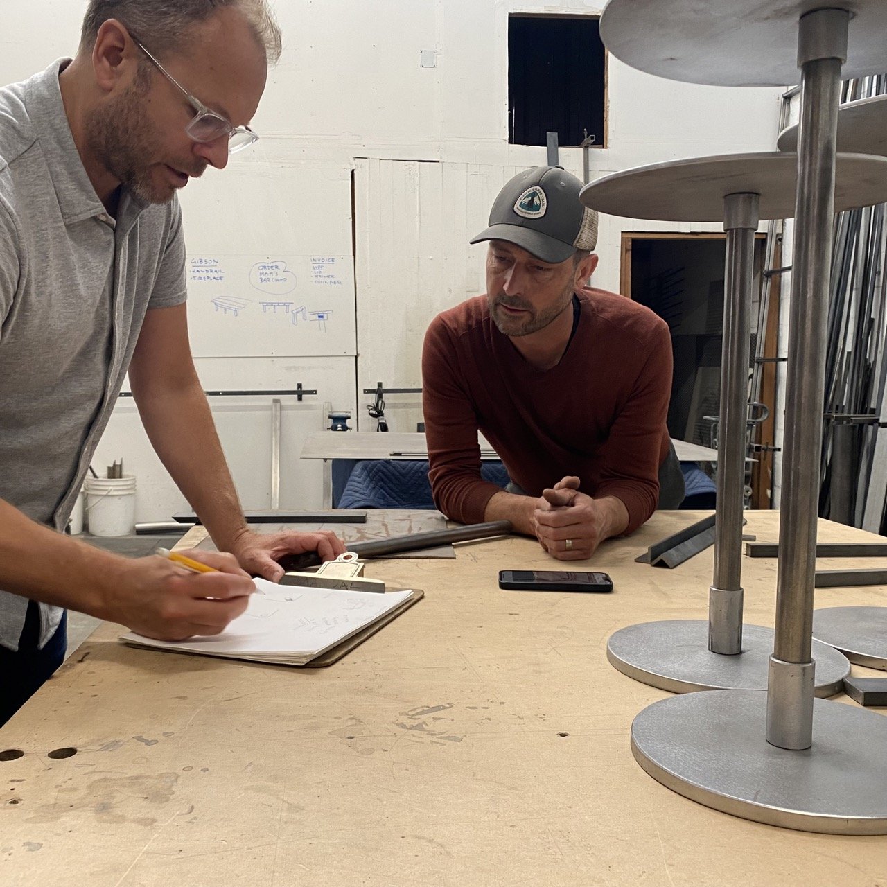
At WDP, we thrive on crafting spaces that not only reflect our clients' personalities but also exude unparalleled charm. One of the key ingredients in achieving this? Embracing custom design. If designing custom pieces for your space sounds intimidating or expensive, please consider the following…

At WDP, we thrive on crafting spaces that not only reflect our clients' personalities but also exude unparalleled charm. One of the key ingredients in achieving this? Embracing custom design. If designing custom pieces for your space sounds intimidating or expensive, please consider the following -
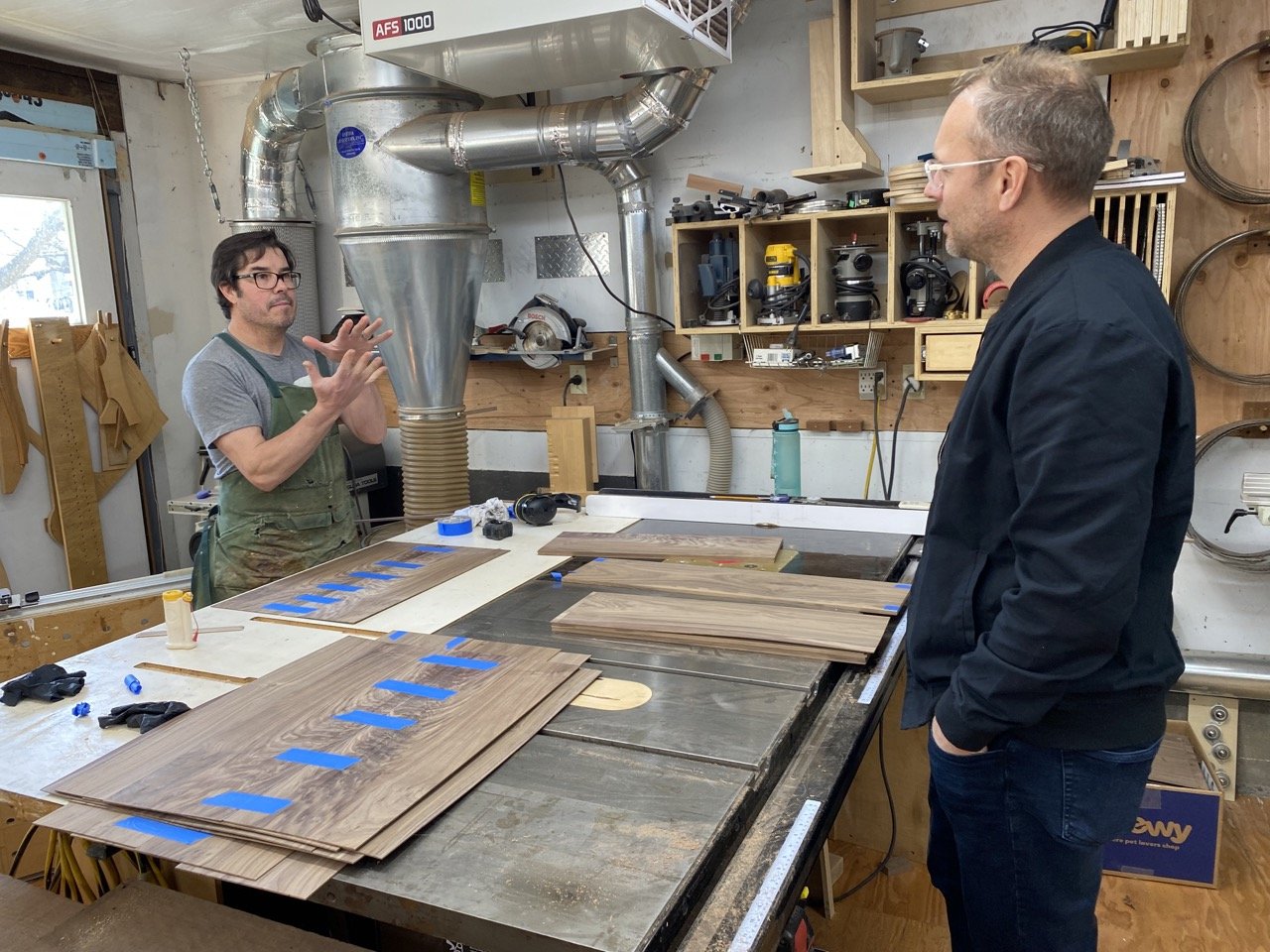
⭐️ Supporting Local Makers: Our commitment to supporting local or smaller fabricators runs deep. By collaborating with artisans in our community, we not only infuse our projects with authenticity but also contribute to the growth and sustenance of our local economy. It's a win-win scenario that we're proud to champion.
⭐️ Time-Efficient Solutions: Surprisingly, custom design often translates to less design time than scouring the market for just the right off-the-shelf product. By working closely with our fabricators, we streamline the process, ensuring swift turnaround times without compromising quality.
⭐️ Cost-Effective Brilliance: Contrary to popular belief, custom design can sometimes be a more cost-effective solution. By eliminating the middleman and avoiding hefty markups, we deliver exceptional value to our clients without sacrificing their vision.
⭐️ Uniqueness Personified: One of the most compelling reasons we opt for custom pieces is the sheer one-of-a-kind nature of the end result. Each custom piece adds an exclusive touch, ensuring no two spaces are alike. It's the epitome of personalization.
⭐️ Quality Fabricators, Trusted Relationships: Behind every successful custom piece lies a network of quality fabricators and trusted relationships. Our extensive resources enable us to navigate the complexities of custom design with ease, ensuring flawless execution at every step of the journey.
It's important to note that while custom design is our forte, we recognize that it's not always the best solution. At WDP, we approach each project with an open mind, carefully weighing the options to determine the most suitable approach.
In essence, custom design isn't just about creating beautiful spaces—it's about telling stories, fostering connections, and bringing dreams to life.